
Easy, Secure and Accessible
Medical Record Management
WellDocs is a mobile app designed to help individuals and families securely manage and share medical records.

The Challenge
Parents and caregivers often struggle to access and share their children's health records when needed for schools, camps, or medical visits. The process is especially frustrating for split or co-parenting families, where documents must be accessed by more than one adult. Existing systems are fragmented, manual, or built for single-user access, causing stress, delays, and miscommunication.
The Goal
Designing a clear, secure, and accessible app that lets users easily locate, organize, and share their children’s health documents. The solution should reduce friction, prevent duplicate effort, and offer peace of mind for all caregivers involved.
The Process
Tools
Figma, Adobe Photoshop, In-Design & Illustrator
Solo Project
4 Weeks
Duration
Discover
Research & Interviews
I began with exploratory research in parenting forums and social media groups to identify common pain points around managing health documents. One key insight was how difficult it can be for co-parents to access and share records efficiently. To learn more, I interviewed 6 parents in split-family situations, while also considering broader use cases to ensure the app supports all types of families. These findings helped shape the concept for WellDocs and guided key design decisions.
Personas
Creating Personas
I created two personas based on my research. One represented a busy parent managing health documents in everyday situations, and the other reflected a co-parent navigating shared access. This helped ensure the app supports a range of real-life family dynamics.

Anna is preparing for her children to join a summer sports camp. The camp requires a recent vaccination record and a medical clearance form.
Master Business Admin
Munich, Germany
Married, 2 children (6 & 9)
Project Manager IT
Education:
Hometown:
Family:
Occupation:
Anna Schneider, 38
"When someone asks for my child’s records, I need to find them fast without searching through folders and inboxes."
Goals
-
Access her children’s vaccination records digitally
-
Download and print medical forms for applications
-
Receive reminders for upcoming health appointments
-
Securely share documents with the school and caregivers
Frustrations
-
Struggles to keep up with required medical forms
-
Finds traditional patient portals outdated and difficult to use
-
Appointment reminders are often scattered across emails and paper notices
-
Prefers a mobile-friendly solution that fits her busy schedule

Bachelor Visual Arts
Barcelona, Spain
Divorced, 11y. old son
Freelance Photographer
Education:
Hometown:
Family:
Occupation:
Tomas Fernandez, 41
Tomás needs to provide his son’s vaccination records to the school before the start of the academic year. Instead of calling his ex or searching through old emails, he wants to log into the app, find the vaccination record, and email it to the school in seconds. The app also notifies him about the dental check-up, ensuring the information is visible to both parents.
"As a co-parent, I need quick access to my son’s health records without constantly asking my ex for them."
Goals
-
Have digital access to his son’s vaccination records and medical history
-
Set reminders for medical check-ups so he doesn’t miss important dates
-
Easily share health records with his ex-partner and his son's school
-
Use an intuitive, mobile-friendly system without unnecessary complexity
Frustrations
-
Often forgets when his son’s next medical visit is due
-
Needs an easy way to access documents without contacting his ex
-
Finds the current hospital portals too complex and slow
-
Wants a way to sync medical updates with shared custody schedules
Pain Points
Keeping Track of Files
The app needs to include a centralized document storage system where parents can easily access, download, and print necessary health records.
Outdated, complex Online Portals
The design needs to prioritize a modern, intuitive user experience with a clean interface, simple navigation, and quick access to essential features like records, appointments, and notifications.
Communication when Co-Parenting
The App needs a secure digital record-sharing feature that allows both parents to independently access and update their child’s health records without having to rely on each other.
Forgetting when Next Appointment is Due
The App needs a notification system that will send timely reminders for upcoming check-ups and required vaccinations, ensuring parents stay informed.
Empathy
Map

Think & Feel
-
“I want to stay involved in my child’s health, even though we’re not in the same household.”
-
“It’s frustrating when I don’t know if the other parent already sent a form.”
-
“I need to feel confident I’m not missing anything important.”
-
Feels unsure if he’s always accessing the latest version of a document.
See
-
Long message threads and scattered file attachments.
-
Multiple folders or screenshots saved in different places.
-
Reminders from the other parent, school, or pediatrician.
-
Apps that aren't designed for shared parenting situations.
Say & Do
-
“Let me know if you already sent it.”
-
“Can you forward that form to me too?”
-
Searches for documents on multiple devices.
-
Often re-downloads or re-sends forms just to be sure.
Hear
-
“I already took care of that, didn’t you get the file?”
-
“We need this signed by both parents.”
-
“Can you send the record again, just to be safe?”
-
Feedback from schools or camps expecting fast responses.
Tomas
User
Journey
Map
Persona
Anna Schneider
Goal: Quickly access, download, and print her children's health records for school, sports, or medical needs without hassle.
Action
Task
List
Feeling
Improvement Opportunities
Realizes she needs a medical record for her kids school.
Searches for where to find the document (physical copies, emails, patient portal)
Accesses the app and navigates to the correct section.
Downloads and prints the document or shares it digitally.
Shares the required document with the school.
1. Receives an email request from the school.
2. Checks her schedule to confirm the deadline
1. Looks through email inbox and old paperwork
2. Tries logging into an outdated patient portal
3. Gets frustrated and remembers to check the app.
1. Opens the app and logs in securely.
2. Uses the search bar to find the right document.
1. Selects the document.
2. Shares it via email to the school.
Notices she can download or prints it directly if needed.
1. Receives confirmation that the submission was successful.
Slightly stressed, wants a quick solution
Frustrated that she can't find it quickly
Relieved that the app is fast and intuitive.
Satisfied that she successfully gets the record ready.
Accomplished and reassured that the task is completed.
Smart Notifications: The app should proactively remind parents about upcoming document needs
Quick search & filtering: A simple efficient way to find records based on date, child's name, or type.
Easy fast but secure login (face recognition/fingerprint etc.)
One-Click download, share or print: allow seamless access, avoid extra steps
Auto-save document history: Keep recent documents accessible for easy reference.
Accessibility Considerations
-
for vision impairment: High-Contrast Text, large fonts, and screen reader
-
Touch friendly UI, with large easy-to-tap buttons
-
Clean simple layout with clear instructions
Define
Problem Statement
-
Anna is a busy working mother who needs a simple way to access, download, and print her children's health records because she struggles to keep track of paperwork for school, sports, and medical appointments.
-
Tomas is a freelance photographer and co-parent who needs a digital solution to access and share his son’s medical records independently because coordinating health information with his ex-partner is inconvenient and inefficient.
Hypothesis
If users can easily search for, access, and share health documents within the app, then they will feel more in control, reduce stress, and complete tasks like school submissions or co-parenting coordination more efficiently.
Value Proposition
Product Features & Benefits
Centralized Digital Health Records
Instant Document Access & Sharing
Automated Reminders & Notifications
Co-Parenting & Multiple Cargiver Friendly Access
User-Friendly, Mobile-Optimized Design
Value of the Product
Saves Time / No more searching or waiting
Reduces Stress & Eliminates Frustration
Enhances Coordination between multiple Caregivers
Ensures Compliance & Readiness
Improves Healthcare Management
Goal Statement
The WellDocs App will let users view, organize, and securely share their children's health records
(and their own), which will affect busy parents and co-parents who often need to submit medical documents quickly, by reducing confusion, improving access, and simplifying coordination.
Effectiveness will be measured by tracking successful document shares, reduced time to access records, and user satisfaction.
Competitive Audit
Through a competitive audit of both direct and indirect health documentation tools, it became clear that most platforms either focus heavily on clinical use or lack features designed for families managing documents across households. Many apps had overly complex navigation, limited sharing options, or did not support collaborative access.
Ideate
How might we & Crazy Eights/Rapid Sketching
How might we make it faster and easier for parents to find and share health documents?
How might we support
co-parents in managing records without confusion or overlap?
How might we make document organization feel intuitive for people with different tech skills?
User Flow
Map

Storyboards


Sitemap
Information Architecture
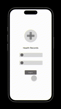
Login Screen
Sign Up
Login
Account Settings
Choose Profile
Profile Settings
-
User Info (Name, Email, Password)
-
Connected Emails (for sending)
-
Notification Settings
-
Default Profile View
-
Login Preferences (Face ID, Biometric)
-
Language & Accessibility
-
Export Data / Backup Options
-
Add/Edit Child Profiles
-
Assign Documents to Child
-
View Activity Timeline per Profile
-
Add Co-Caregiver
-
Shared Access Settings (View-only or Full Access)
-
See Last Action by Caregiver (transparency)
Help & Support
-
FAQs
-
Contact Support
-
Privacy Policy
-
Terms & Conditions
-
Leave Feedback
Calendar
-
Upcoming Appointments (manual or connected)
-
Due Dates for Forms
-
Smart Reminders (vaccinations, expiring forms)
-
Add custom health-related events
Dashboard
-
Recently Accessed Documents
-
Upcoming Appointments or Deadlines
-
Add New Document
-
Quick Access: Last Shared, Favorites
-
Smart Reminders
My Documents
Subfolders by Type:
-
Vaccination Records
-
Medical Notes
-
Prescriptions
-
Lab Results
-
School & Camp Forms
Per Document Actions:
-
View / Preview
-
Share
-
Save / Download
-
Add/Edit Note
-
Set Reminder
-
Mark as Sent
-
Add to Favorites
-
Delete
Inbox
-
Sent Documents Overview
-
Sent To / Subject / Timestamp
-
View Email Content
-
Resend or Forward
Search & Filter
-
Global Search
-
Filters:
-
Document Type
-
Profile (Child/Parent)
-
Date
-
Tag/Keyword
-
Sort by: Recently Accessed, Name, Last Shared
-
Save Filter Views (optional)
Favorites
-
View favorited documents
-
Sort and access quickly
-
Unmark anytime
Share
-
Select Document
-
Choose Recipient Email
-
Select Sender Email
-
Add Subject / Message
-
Attachments Preview
-
Undo Send Option (limited time)
-
Sent History Overview
Prototype
Paper Wireframes
In my initial sketches, I focused on drawing the search bar and a list of documents, as I considered it the most important function. However, I later realized that a dashboard with a quick search function would be more beneficial, as it would make other essential actions immediately accessible and place greater emphasis on the selected user profile.


There are many relevant factors when searching for a document in an app. You want to be able to filter and sort your search, view recent searches or activities and maybe see details like date/status of the document without needing to click further. I also noticed that it is be important to clearly indicate which user profile is chosen, especially in a medica context.
Digital
Wireframes
Low-Fidelity Prototype
The concept of an intuitive, easy-to-navigate dashboard for each medical profile emerged during the paper wireframe process. When handling medical information, it is crucial to ensure that documents are not mistakenly associated with the wrong person.
Clear display of the selected medical profile to prevent mix-ups (including profile picture).

Centered search bar for quick access to the right document with minimal taps.
Key reminders and quick calendar overview to stay on top of deadlines and appointments.
The primary function is to quickly and easily find the right document. A search bar, filters, sorting options, and document previews ensure a smooth user experience. The email preview clearly indicates the recipient of the document, and a confirmation screen appears after sending.


Document Folder
Individual Document View
Email Preview
Email sent successfully
Usability
Studies
Prototype for Usability Testing
In this low-fidelity prototype, users can log in to access health records for different individuals, such as family members. They can select the appropriate profile and navigate a dashboard to search for documents, view notifications, set reminders, and check the calendar for upcoming appointments. This prototype tests the main user flow, including logging in, accessing a profile, searching for a document, and sending it via email. Additionally, users can review notifications, reminders, and profile settings.
Usability Studies - Plan & Protocol
Insights from the usability testing with the low-fidelity prototype were synthesized using an affinity diagram. By clustering observations and feedback into themes and identifying recurring patterns, I identified key user needs and pain points. These findings informed the next steps in the design process.
Insight Identification - through Affinity Mapping
Co-parents wanted to know who last sent which document & desire for "add private note" feature
Some users initially downloaded documents before discovering the share button.
Users with multiple email accounts needed more options and clear visuals to avoid confusion.
Users didnt like log in (too slow) - asking for face ID and secure login methods.
Desire for personal documents storage, although the app is designed around children's records.
Desire for "Favorites" function and more options to organize the documents.
Refine
Mockups
Based on the insights from the usability studies, I applied the design changes, including a clear navigation system and search and a straightforward flow.
Before > After
.png)

Log In


Choose Profile


Dashboard


Email View


Document View


Success Notification
High Fidelity
Prototype
Full User Flow
After finalizing the low-fidelity wireframes, I worked on creating the final design with the goal of making them simple and intuitive:
User task: Login to WellDocs, choose a profile, find vaccination record and send it via email to the school.


Final components were built after initial mockups. From there, I refactored key UI elements into reusable, responsive components to improve maintainability and scalability.
Design
System
Logos

Colors

Typography

Components


Accessiblity
Considerations
Color & Contrast
Selecting a primary color palette that met WCAG AA contrast standards to ensure visual accessibility before moving into UI design.
Face ID & Reduces Input
Face ID login and sender email memory reduces cognitve and motor load for users who may have difficulty typing.
Clear Language
Avoiding complex language and emphazising clear typography (sans serif).
Text Hierarchy
Implementing semantic text hierarchy throughout the app.
Touch Targets
Buttons and interactive elements were designed with invisible padding to ensure 44px touch targets.
Screen Readers
Tab order and focus states designee for screen reader compatibility. Icons include descriptive alt text.
Going
Forward
Key Takeaways
This project deepened my understanding of designing for real-world complexity, especially in emotionally sensitive contexts like health and co-parenting. I learned how important it is to validate assumptions through research, and how small usability tweaks can significantly reduce user frustration. Balancing simplicity with flexibility became a central theme, and accessibility considerations played a key role in shaping inclusive design decisions.
Learning
-
Research early on helps uncover use cases you may not have anticipated
-
Simple UI doesn’t always mean easy UX, user expectations can vary widely
-
Small changes in visibility and hierarchy can have a big impact on usability
-
Designing for co-parenting revealed the value of shared access and transparency
-
Accessibility is not just about compliance, but about creating dignity in use
-
Prototyping and testing iteratively saved time and clarified priorities
Next Steps
-
Collaborate with developers to validate technical feasibility of key features
-
Begin mapping out error states and edge cases for the full user flow
-
Extend accessibility testing to include users with assistive technologies
-
Create a cross-platform responsive design. The goal is to build the same experience for all users, no matter what type of device they are using.